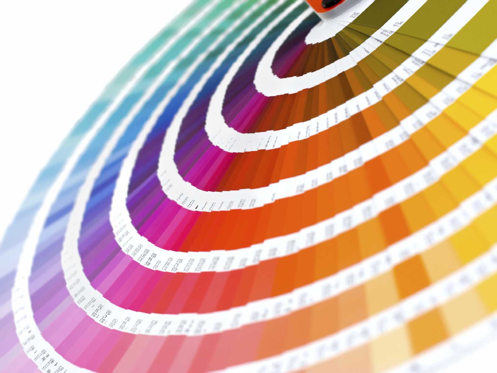
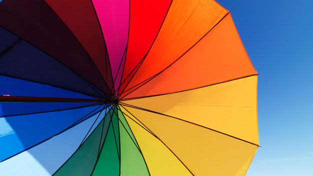
Effective graphic design depends upon the combination of various elements. Colors are one of the most important of these elements, as they are representative, symbolic and used for communication designs. Study of colours and its effect on individuals has been influential and very important. Designers and artists must have a great understanding the psychological impact of various colors, and be able to utilise them correctly in artwork, advertising, clothing styles, interior decoration and of course, graphic designing.
Composition, layout, image, font and color are all various elements of graphic design that fuse together in a meaningful way to effect the way a message is perceived by the viewers. People are more lured in towards those designs which are visually attractive and appealing. Color and typography are the two most important elements in a design’s composition or initial idea. Perceptions of color can be different depending upon the culture or nation, however some colors have universal meaning. For graphic design to be effective, color is one of the most crucial factors designers must consider, because it is used to influence the target market for a specific product.
There are two groups of colours — cool colors and warm colors. Colors in the red area of the color spectrum are known as “warm colors”. These include reds, oranges and yellows. These colors include the feelings ranging from warmth and comfort to the feelings of anger and hostility. Colors on the blue area of color spectrum are classified as “cool colors”. These include blues, purples and greens. These can be called as calm colors and include the feelings of sadness or indifference. Did you know? The human eye identifies warm colors before cool colors.
Color is one of the most useful tools for a graphic and web designer. These creative business are about being visually attractive and appealing to the potential customers’ eye. To make your website, portfolio or design work visually appealing, proper color schemes be — especially to reflect the brand image. Colors should be used wisely in order to express the purpose, theme, personality and objective of the business. Proper use of color can make your site stand out from other sites on the web.
 Some helpful tips: Harmonious colors should be used. Color repetition can be used in a design to create harmony, balance and an overall sense of brand continuity and consistency. Colors can be used to draw attention of the viewers on the most important parts of the site but do keep in mind that overuse of color can tire the eye and potentially distract the customer from the key message. Experimenting with colors can cause surprising results, so do not be afraid to try to experiment as much as possible. Proper research about the target audience is a must before selecting the specific colors for any design.
Colors and Their Effects on Individuals (physically and emotionally):
Blue: Calming, cooling and it aids suspicion.
Green: Soothing, relaxing mentally as well as physically, offers a sense of renewal, self-control and harmony.
Yellow: Mentally appealing, activates memory and encourages communication.
Orange: Encourages activity and socialization.
Red: Increases energy, stimulates energy, encourages action, confidence.
Purple: Artistic, calming to mind and nerves, offers a sense of spirituality and encourages imagination.
Brown: Feeling of wholesomeness, stability, connection with the earth and offers a sense of orderliness.
White: Aids mental clarity, encourages us to clear clutter or obstacles, evolve purification of thoughts or actions and enables fresh beginnings.
Grey: Unsettling and vigilant.
Black: A restful emptiness, powerful, mysterious, evoking a sense of potential and possibility.

