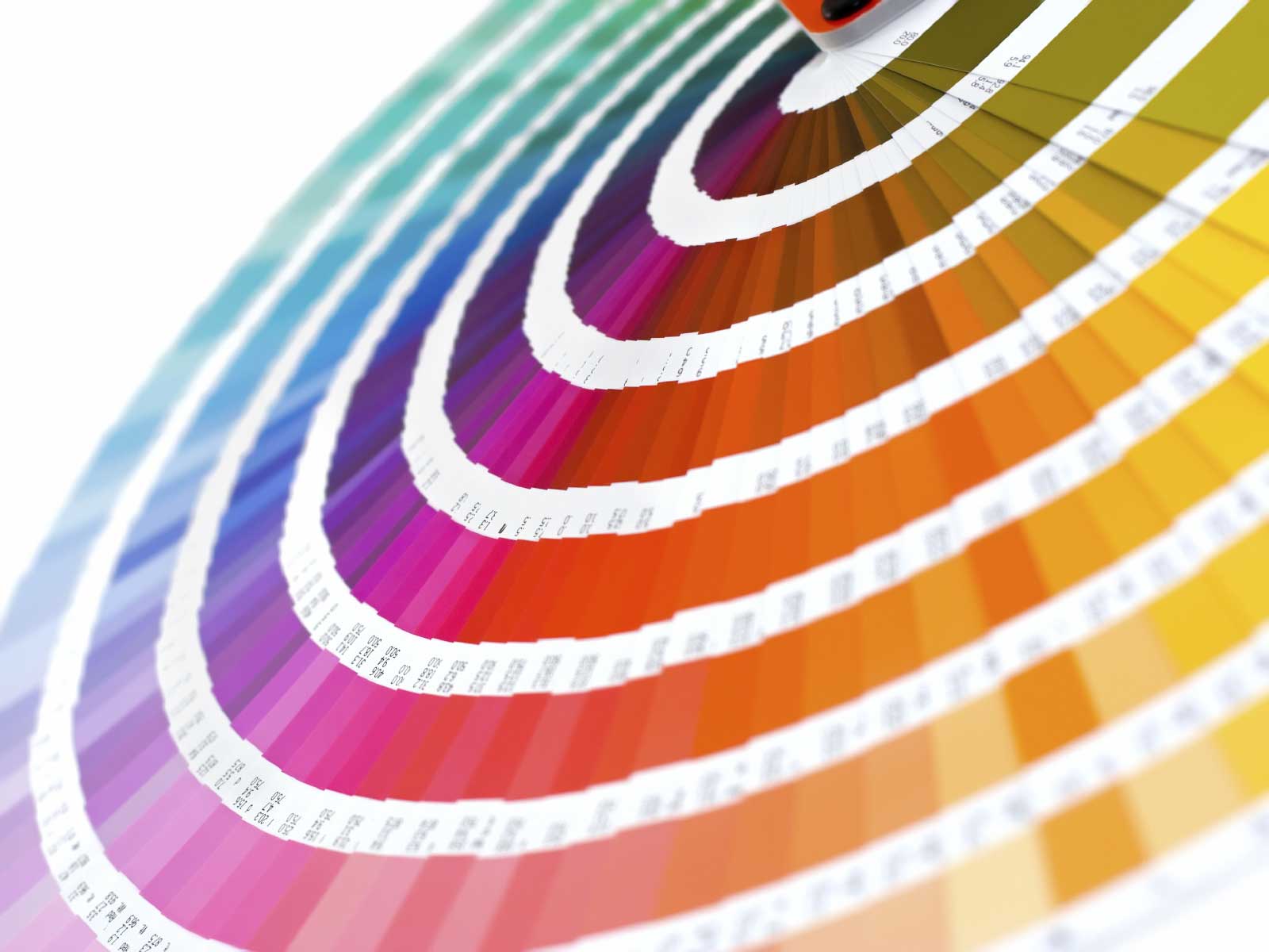
The Pantone Matching System (PMS) is a standardized colour reproduction system, which has been used for over 40 years, primarily for printing purposes in a variety of industries, from design, architecture, fashion and crafts.
Similar to the CMYK (cyan, magenta, yellow and black) and the RGB (red, green and blue) systems, the functional technology, Pantone Matching System was introduced in accordance to a prolonged monetary requirement for a packed scheme granting a perfect blend of gleaming colors. The primitive Pantone system was introduced to endow the commercial printing industry with most correctly defined and specified colours and inks. An authenticated PMS name and number is specified indicating the accurate matching scheme. Pantone also created the Pantone Process Guides so graphic designers, artists or fashion designers who print using four-color printing can reference and see what the colors will look like printed in the basic cyan, magenta, yellow and black inks.
 Pantone colors are essential to the graphic design industry in order to create unique designs with specific detail and colour arrangements. It enables the designers to pick up the best suitable shades from the PMS color chart or swatch booklet and are a great way to find the exact hue desired for designing and developing corporate brands for branding applications — expressing individuality through a specific choices of Pantone colours.
Another benefit of using the Pantone Matching System is the fact that designers may see a colour on the screen when creating, however when a proof is printed the colour may not be the exact match, due to choice of paper stock and printer variations. This is why selecting a specific Pantone colour with a customised code, allows the printers, designers and clients to be confident that the colour chosen will print exactly how it is seen in the Pantone chart or booklet. The Pantone system also allows for many special colors to be produced, such as metallics and fluorescents.
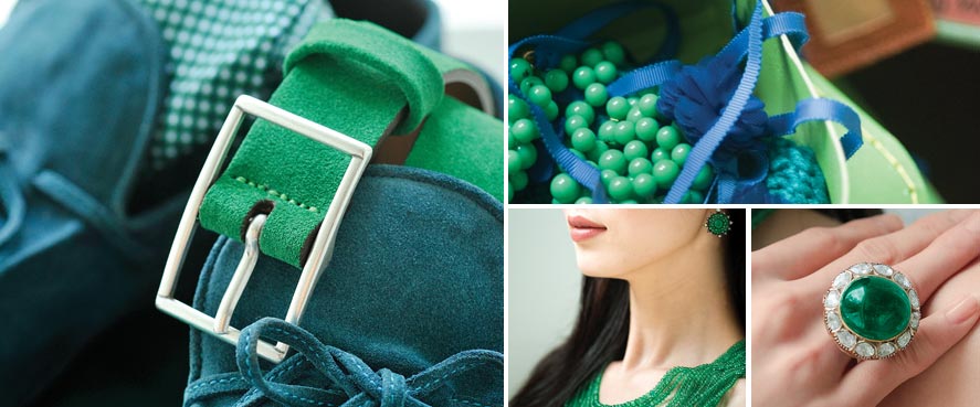
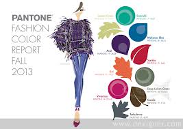
Fashion designers and creatives utilise the Pantone colour system to create the colour range for their latest collections. For instance, the ‘in’ colour and trend for this season (2013) is Emerald Pantone colour 17–5641.
A handy little trick — be sure to keep your Pantone Matching System booklet or swatches out of the sunlight, so the colours do not alter and fade.